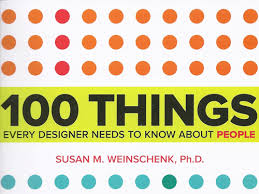
12 Most Useful Insights Every Designer Needs to Know About People.
Have you ever wondered what people actually see on your website? How they interpret what you write? What lens they view life through? How you as a Designer should compensate for this? After reading the book ~100 things every designer needs to know about people, I am far more confident that I am on the right track.
I read “The 100 things…” by Susan Weinschenk PH.D, flavored by both the lens of the past; in the form of my education from the books on “Visualization of Information” by Edward Tufte, and through my lens of today, creating a seamless experience for customers whatever their devise and wherever they are.
1. Peripheral vision is used more than central vision to get the gist of what you see
Knowing this now will change the “what and “how” I design the edges of the screen; for example I will pay even more attention to side-bar design on a Blogsite, making sure it is clear and easy to read, as this may be the first impression a visitor gets of your website or presentation. On a smart phone this might only be a ‘feel good’ color around the edges.
2. People remember only 4(!) items at once
This really resonated with me, especially as a website I am currently designing has 7 informative pop-ups on the landing/home page; usually presented as a list of seven options. I am seriously rethinking this; how to make it easier to both navigate, and easier to remember. It’s no accident that US phone numbers look like this 123-456-7890; (threes chunks of 4 or less items).
3. People are happier when they’re busy
But they need a reason to be busy. On a website or presentation I interpret this as keeping people “busy” focusing & holding their attention by the journey of discovery I design for them. The journey is far more interesting with interaction & response. As technologies like leap motion or Prime Sense become mainstream, it’s going to be difficult for designers to restrain themselves!
4. People think choice equals control
People need to feel in control and that they have choices. Designing different ways to discover the information, even if some may be a tad less efficient, allows the option of choice = control. We all think our online visitor has limited time and insists on the shortest distance from A to B, however it seems people actually prefer making a choice, even if it takes them on the path less travelled!
5. People scan screens based on past experience and expectations
The area of the screen where a person looks first, is dependent on what they are doing (intent), and their mental model of what they want to see, and where
they expect to see it. This is something I really have to keep in mind when designing, as I most often design for ‘new and different’. I have to remember to not stray too far away from people’s expectations, as they might feel strange, or even alienated, and that’s obviously not the customer experience I want to create for your customers.
6. Using sound to get attention
Especially sound resulting from certain actions. We often don’t think of designing “sound effects” into our customer’s online experience, other than the usual ones; sending message, tweeting, or hard-drive crash J. With this in mind, should I add the sound of a ‘water drop’ to our donate button, and have it go “plink” when someone contributes to a water project in Africa? (I am thinking more like the sound of a drop of water hitting a pool, than a toilet flush). Humor is another way to capture attention; I know about that, and do it often!
7. People may care more about time than money
This is a difficult one, especially applying this to a non-profit website, where amongst other things we are asking for contributions. My take on it; if those who visit our website experience a ‘good’ time, which is helpful to them and resonates with their own goals and feelings, then regardless of the time spent, they will be inclined to join our community.
8. Your brain responds uniquely to people you know personally
Or people you think you know, because they look just like someone you do know! We’ve been applying this principal for years, profiling your customer, their preferences, their habits, and how they look. With this information we have used ‘look & do alike’ images in ads, TV spots, and more recently online. Now I have a better idea of the ‘why’.
9. Anecdotes persuade more than data
While telling stories is in style big time now, for some of us it never was out of style. Telling stories is an integral part of ‘content marketing’, and people always remember stories or at least parts of them. The point here is today we are inundated in data, often poorly presented and misperceived, but if you can tell an interesting story, it evokes empathy, which triggers an emotional reaction. Emotions trigger the memory centers. You now have a captive audience, who remembers what you say! (for better or worse, remember!)
10. People are programmed to enjoy surprises
Things that are new and novel capture attention. I interpret this as creating a journey of discovery on a website, providing novel or unexpected content and interactions. Added to this could be the promise that there will always be something new upon your return. Caution though; too much ‘surprise’ might be a turn-off, no one likes a negative surprise!
11. People feel more positive before and after an event than during it
This means we should extend the anticipation of any event as long as possible, and then wait a few days before asking people for satisfaction ratings. You usually can’t control where someone exits your online presence the way you can from your house, but that last experience can often flavor the entire visit, just like that fabulous dinner the last night of your vacation can.
12. People use Look & Feel as their first indicator of trust
When participants in a recent study rejected a website as not being trustworthy, 83 % of their comments were related to design factors, such as unfavorable first impression of look and feel, poor navigation, color, text size, even the name of the website. Remember, you can only make the first impression once, and the design and UI will be pivotal in the journey of establishing a relationship of trust with your customer! (I bet all you designers will really resonate with this)!
This is an important read for any designer, because the author backs up the 100 things with qualified background research, giving the all important “WHY.”
So, what “things” resonated the most with you?
CASUDI Designing Success!
Disclaimer: I bought my own copy from Amazon; no freebies for promo here!
“Republished with permission, courtesy of 12 Most” The 12 MOST Useful Insights from the book 100 things that Every Designer Needs to know About People, that resonated with me, and why!– ORIGINAL POST


