SPA STYLE ~ A Hindsight Post
I designed my ‘spa style’ ensuite 10 years ago…..well before it became fashionable; so now with “hindsight” in full gear, what would I have designed differently?
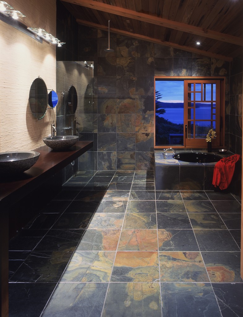 The very short answer is “not much”!, as I am still totally happy with my design. Especially pleased as this was spa style on a budget, which I created to look like cost-no-object! I take an opposite approach to many designers, and use many fewer textures, which I believe results in a more luxurious look. I see many overly complex designs, with multiple tile sizes, colors, surface textures, all trying for that “luxury” look (the more the merrier!); to me this just equates to busy! And in the case of spa style, “busy” defeats the relaxation objective!
My spa floors and walls (all but one) are Brazilian slate (a rather common one in Brazil I was told by the ambassador, who visited recently). I purchased 3 pallets (& did a second guest bathroom) and I got a hellishly good price I should add! But beware; I made up for this discount in labor, as the tiles were hand cut in Brazil and not quite square! To compensate for this I had to use wider grout lines, something I usually hate…but the cost of re-cutting every tile to square would have been prohibitive. I worked closely with the tile setter to hand pick each one, always looking to create a design, somewhere between a galactic impression and a Rorschach test. Well worth the added trouble, as every day I read new interpretations into the patterns; it’s still fresh after 10 years, and I am delighted with the idea of it being created from color variations made in nature.
I still love my spa style design!
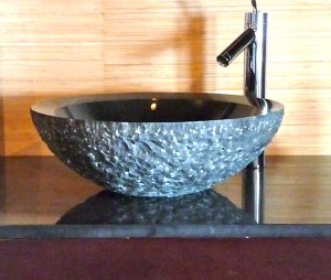
The bamboo wallpaper carries the theme in from the outside landscaping, and the granite lavabos further embellish the organic connection with the earth ~ rough on the outside and polished interior. The individual mirrors each have a swing-out magnifier appendage… so practical for close ups.
I used a combination of Hansgrohe (Philippe Starck) and Vola (Arne Jacobson ) ‘60s plumbing hardware. Both are great to use (important when you select something for everyday use), and both designs work well. Not shown in any of my images are the commode and bidet also by Starck.
Recycled redwood planks from pickle vats (Vlasic in Canada) grace the ceiling. No, there is no pickle smell in my spa!
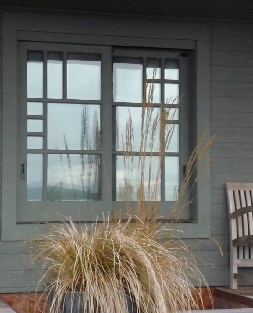
The window was an extravagance ~ and (confession) drove me over budget….but well worth it. I had some tough negotiating with Quantum who made the one-of-a-kind window; they wanted an up-charge because both sides of the sliding windows are not symmetrical! Ha!
The view when showering or soaking needs no mention.
The sunken soaking tub and shower were designed to accommodate minimal frameless glass; in fact only one glass wall, which supports both the counter and minimizes the rain head shower splash. The shower floor is contiguous, (no dam to trip over) and sloped to the corner.
Storage is always hard when you are trying for minimalist.
So thinking outside the box, we added two side-by-side pantry storage pullouts (12” wide & 52” High), and have more space than a traditional cabinet. Today (in hindsight) the lower “hamper” pullout (24” wide by 32” high) would partly accommodate a warming drawer! Yes, think kitchen …… apply to spa…… some clients incorporate a wine fridge……
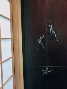
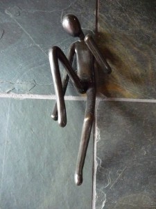
I like to add “art” to every design and these handle pulls by Sokostudio meet the “art” criteria. And when we needed hooks…..well that came out of the “art” budget!
In spite of my on-going love affair with my spa, there are a few things I would have done differently….
Number 1 on the list would be a heated floor in the shower, and number 2 a heated deck surrounding the soaking tub….oooooh so cold! Not easy to retrofit now, but a good thing the rest of the floor is radiant heated. If I ever redo the millwork, I’ll add that warming drawer….not for pizza but for towels!
In one of those “s**t happens” moments, the original wood counter surface was compromised by one of the trades. Happens sometimes, especially when the order of work gets skewed (the plumber fails to arrive on time, etc.). After a bit I decided I couldn’t live with it any more, but I didn’t want to go through the aggravation of returning it to the cabinet-maker or have the “internal” mess of refinishing! So I found a slab of granite, very similar to the sink interior, and had it polished to match. It was installed in a couple of hours and though it added another layer, it did not compromise the overall design. (image below)
Not too long after I completed my spa style, a client visited my Island Retreat and desperately wanted to duplicate my spa design in her 38th floor penthouse suite. After a few attempts, we agreed that my island design was actually a bit too rustic for the city slickness of the rest of the penthouse, so this is what we designed.
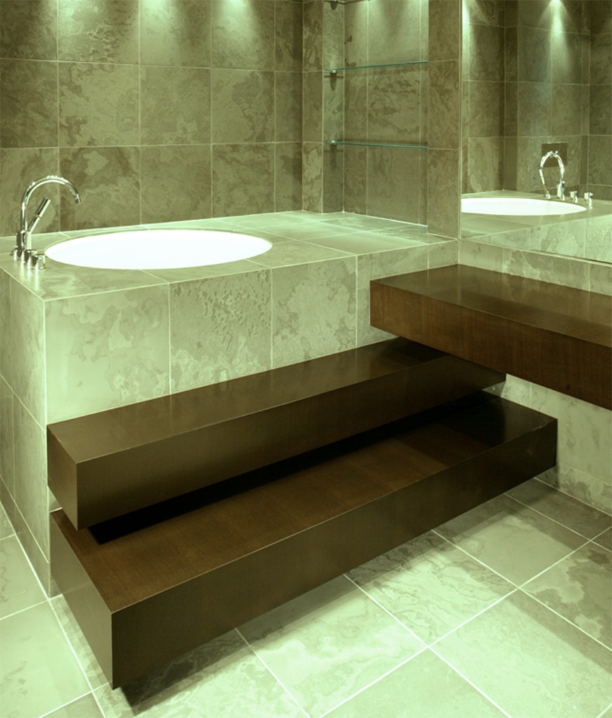 We selected polished slate (actually not too different from mine unpolished, if you can believe that). I placed the tub on the actual floor (occupants below said “no chance” to drop it down through to the condo below!), next we built up the surround, and designed free-floating wood steps, dramatic indirect lighting and plenty of glass and mirrors. Again, the walls and floor are one continuous texture, all, 16’ X 30‘ of the space
We take inspiration from very high-end luxury spas in upscale resorts around the world, and reinterpret them for our homes. Keep it simple, minimize the number of textures, keep everything consistent, add dramatic indirect lighting, and one-of-a-kind focus art pieces, if budget allows. And keep out the clutter…spa is synonymous with relaxation and relaxation and quiet, and requires a serene, meditative environment.
If you liked this post please check out my first Hindsight post on kitchen design (looks like I am into a series), and be sure and read my guest post on 12MOST about having fun obsessing over designing your own space.
Please comment with any of your thoughts or ideas for spa style. Have I missed anything important?
CASUDI……hindsight is 20:20





November 1st, 2011 at 10:07 am
I can see how the one design translated into the other, Casudi. Personally, I think your own spa environment appears more inviting. I love the warmth of the Brazilian slate. I’d be surprised to find it cold, but I understand why it would be!
Thanks for sharing the inspiration. 🙂
November 1st, 2011 at 10:57 am
Slate is only cold (to the touch) when there is no heat source under it ~ as far as the look, the warn colors of the natural unpolished slate are extremely warm in appearance. I guess your taste leans toward island rustic rather than city slick….surprise! Yet, in the desert where you are, one might do things very differently. Design is of course a balance between the preferences of the client (& their lifestyle) and appropriateness for the particular residence or environment. Brian, as always I appreciate your comments.
November 8th, 2011 at 8:00 am
[…] to the kitchen in the resale index is the bathroom, and the trend is toward “spa design.” Since this may be seldom seen by outsiders (unless you are like some who show yourself […]
November 20th, 2011 at 7:39 pm
Beautiful use of materials & details! As a working professional interior designer
I always admire and appreciate your interior insight on twitter & Blogchat too!
Thank you! JB
November 20th, 2011 at 8:04 pm
Thank you Julie, this means a lot coming from you. I really like how you integrate lifestyle and stories in your design. Blogchat is fun and I’ve met some really great people there who have become online friends and some IRL. I look forward to a continuing conversation as I love to cross pollinate with other designers.
January 13th, 2012 at 4:01 pm
[…] to the kitchen in the resale index is the bathroom, and the trend is toward “spa design”. Since this may be seldom seen by outsiders (unless you are like some who show yourself via […]